We @ Trends 2022
We @ Trends 2022
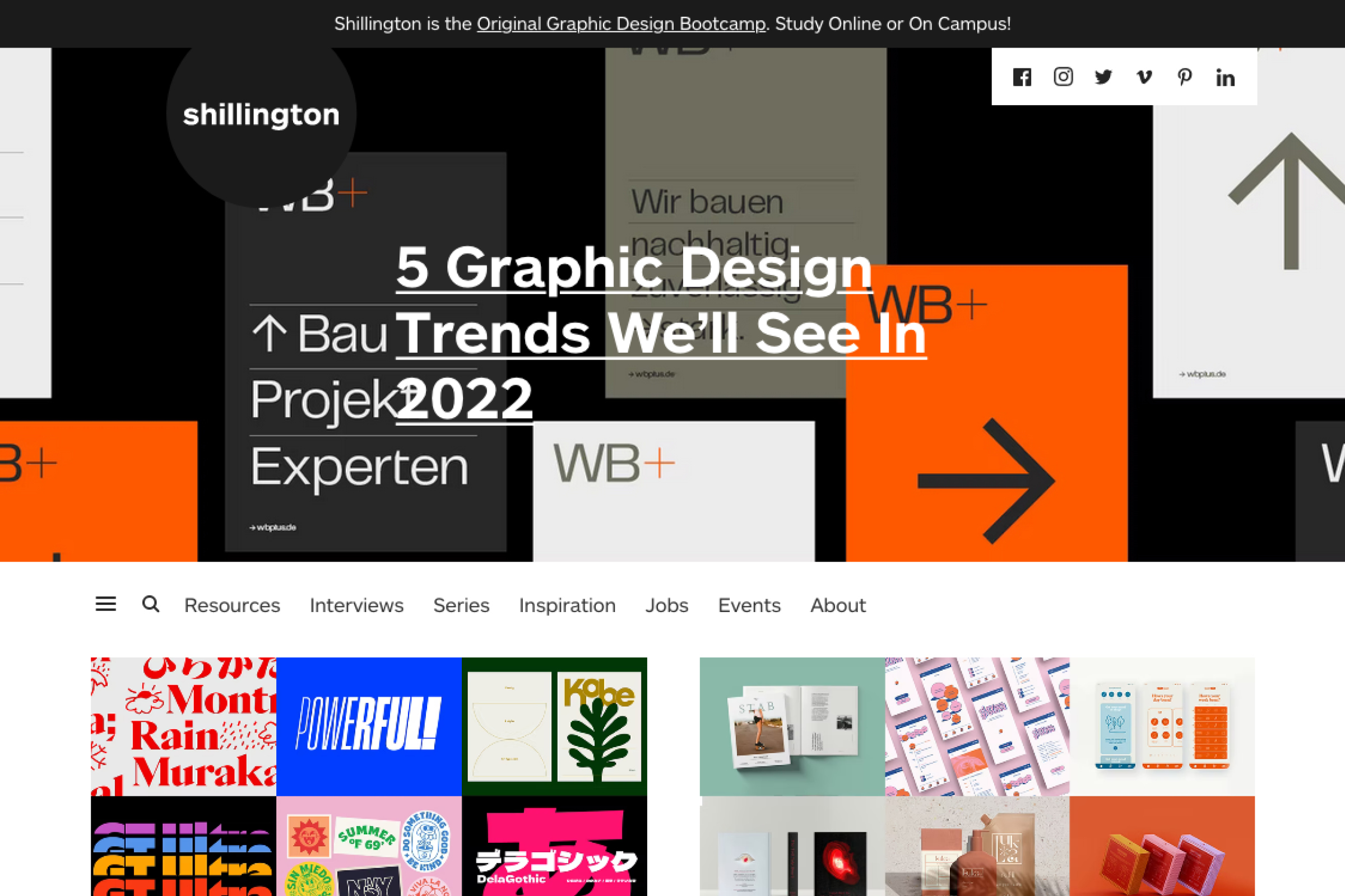
Neue Deutsche Welle mit Anti-Design: unser Branding-Projekt für WB+ zeigt laut Shillington Edu NYC, was 2022 in der Designwelt erwartet wird.
Neue Deutsche Welle mit Anti-Design: unser Branding-Projekt für WB+ zeigt laut Shillington Edu NYC, was 2022 in der Designwelt erwartet wird.
Neue Deutsche Welle mit Anti-Design: unser Branding-Projekt für WB+ zeigt laut Shillington Edu NYC, was 2022 in der Designwelt erwartet wird.
16. Dezember 2021
16. Dezember 2021

Und hier der Auzug aus dem Artikel:
Und hier der Auzug aus dem Artikel:
„Over the last couple of years we’ve seen a renaissance of complex Anti Design/New Wave styles with challenging colour palettes, repeating characterful type and visual effects,” says Shanti Sparrow, Global Head of Teaching at Shillington.“
„Over the last couple of years we’ve seen a renaissance of complex Anti Design/New Wave styles with challenging colour palettes, repeating characterful type and visual effects,” says Shanti Sparrow, Global Head of Teaching at Shillington.“
Shanti Sparrow
Global Head Shillington Education NYC
Shanti Sparrow
Global Head Shillington Education NYC

In the 2010s, the increased focus on digital design, particularly for apps, meant sterile functionality was often emphasised over all else. Hence the recent rise of the so-called Anti Design/New Wave style, which pushes back against homogeneity by bending, and sometimes even breaking, the rules of graphic design. Check out the branding of WB+ by German studio VISEE Design for a great example of what to expect.
“Over the last couple of years we’ve seen a renaissance of complex Anti Design/New Wave styles with challenging colour palettes, repeating characterful type and visual effects,” says Shanti Sparrow, Global Head of Teaching at Shillington.
“After this, a return to simplicity and bold minimalism could speak more directly to a post-pandemic mindset,” she adds. “Simple palettes using a pop colour, neutral fonts and gridded layout structures will add comfort, and make the message the focus of the design.”
WB+ @ Design Made in Germany →

Projektanfrage?
Was können wir für Sie tun?
Projektanfrage?
Was können wir für
Sie tun?
Projektanfrage?
Was können wir für Sie tun?
Projektanfrage?
Was können wir für
Sie tun?
Projektanfrage?
Was können wir für Sie tun?
Matthias Seeburger
Kreation & Kommunikation
Wir gestalten Zukunft.
Immer neu.
Wir gestalten Zukunft. Immer neu.
Wir gestalten Zukunft.
Immer neu.
VISEE Design
Seidenstraße 57
70174 Stuttgart
VISEE Design
Seidenstraße 57
70174 Stuttgart
VISEE Design
Seidenstraße 57
70174 Stuttgart
T 0711 50 73 538
M 0160 26 24 599
hallo@visee.design
T 0711 50 73 538
M 0160 26 24 599
hallo@visee.design
VISEE Design ist eine Kreativagentur für strategisches Markendesign & Kommunikation aus Stuttgart.
VISEE Design ist eine Kreativagentur für strategisches Markendesign & Kommunikation aus Stuttgart.
VISEE Design ist eine Kreativagentur für strategisches Markendesign & Kommunikation aus Stuttgart.
